Cubitts
IN A NUTSHELL
Cubitts sells ‘spectacles’ and take great pleasure in doing so. But in 2018 they were still grappling with their brand identity. They asked me to help pin it down to pave the way for the next stage of growth.


The Cubitts website back in 2018
Founder, Tom Broughton is very much the personality behind the Cubitts brand. An industrial designer with staunch principles and a sharp wit, Tom created Cubitts in Kings Cross after falling in love with its local history.

Tom Broughton, photo by Paul Harmer
It wasn’t hard to work out what was special about this company. But it wasn’t easy to find the words for it. As it happened, one word in particular proved to be most important of all. A footnote destined to be a headline.

FULLER STORY
Speaking with customers, I was struck by the consistency of Cubitts’ appeal even across generations. Its artisanal approach to design and service was a treat for those who adamantly rejected fast fashion.
““We care. Like genuinely give a shit. About every single little part of it.””
In contrast to competitors’ corner-cutting and profane part-gluing, Cubitts finishes every pair of spectacles by hand with its signature butterfly rivet. A simple act that makes repairs more straightforward.


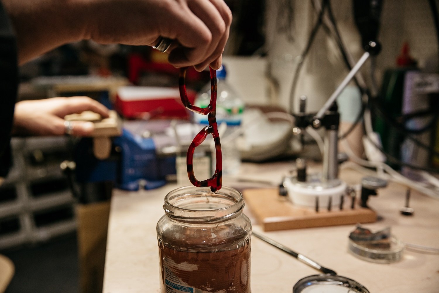

This rivet design is one of many details inspired by the Cubitt brothers, prominent architects of the Kings Cross area in the 19th century. Tom became obsessed with resurrecting traditional processes for everyone’s gain.

Thomas, William and Lewis Cubitt
BETTER FOR EVERYONE
The vision was to combine craft and accessibility; traditional values and contemporary culture. This distinguished Cubitts from both fast fashion and luxury brands by bringing quality and care to more people.
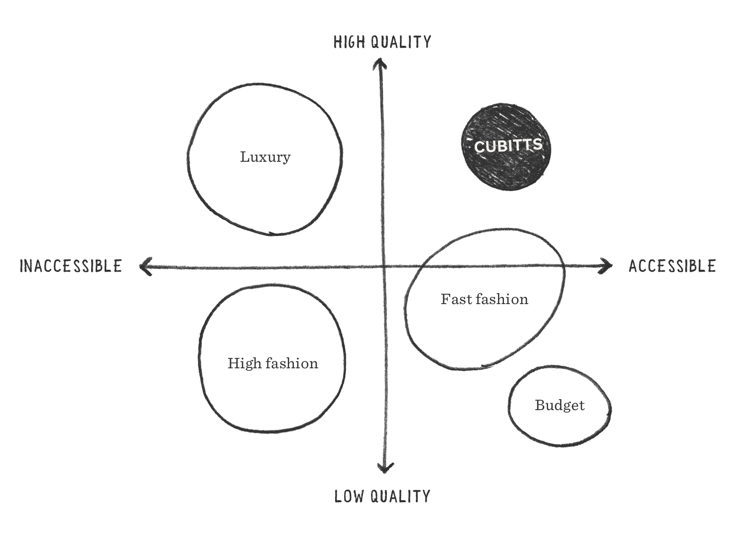
A category sketch from the research phase
This is a company that runs workshops to help people make their own spectacles. They made a newspaper. And a chess set. In a sea of mass manufacturing, Cubitts are Makers to their core.


MAKERS
This word was the ah-ha moment. Until now, “Spectacle makers” had been a mere bullet point, on equal footing with ‘eye exams’. We realised it should be the central idea. And no competitor could claim it as credibly.
Importantly, their identity as makers was what validated the strategy. Makers care about both their craft and customer, thus shrinking the gap that mass manufacturing had put between them.

And so ‘The Modern Spectacle Maker’ tagline was born, elevating Cubitts’ Maker DNA from casual mention to headline proposition. Looks good on green too.


The Cubitts website in 2024
‘The Modern Spectacle Maker’ is a purposefully quiet statement but it provided instant clarity about how the brand should evolve. At the time, their models looked like other brands’ models…

I proposed that Cubitts should feature real makers and designers; actual craftspeople who lived by its values. Which is what they went on to do rather strikingly:

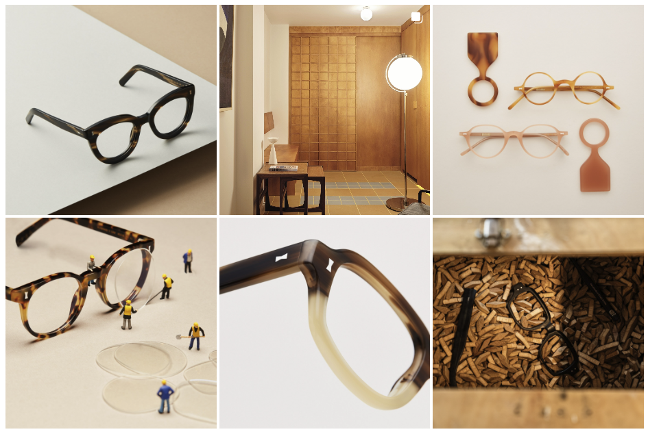
Cubitts’ content was further refined, curated and photographed to look like pieces of art in a studio. Thoughtful and playful but never pretentious. Simply making, in public, for all to see.


Codifying it
To make it applicable, I created three brand attributes: egalitarians, fanatics and vanguards. As impassioned makers, Cubitts’ fanaticism was the ‘butterfly joint’ that held it all together.

I then showed how these attributes could be used to guide decisions. From product design to writing confirmation emails. It was about providing practical, relatable examples for the team:

Two of many illustrative examples
Cubitts would later, with the help of writer and poet, Thomas Sharp, hone its use of language exquisitely. It’s a voice that lays bare a fanaticism for craft, curiosity and always keeping things interesting.


Final thought
This project was about sharpening the brand, not changing direction. Cubitts knew who they were. Sometimes you just need to look through a new lens or two to see things more clearly.